Background

Visual Accessibility Project: GIT 480 redesign game assets and UI in a Unity ready format and showcased with motion graphics in After Effects.

Creative Brief

Development Document

Objective

Improve visual accessibility and design of graphic assets and UI while maintaining retro brand aesthetics. Encourage new audiences once disinterested or discouraged to engage with the product Vampire Survivors. Specifically: a better use of contrast, white space, composition, and typography.

Vampire Survivors (2022) was developed with inexpensive and open source resources. Evident of the complaints by players, visual clarity and accessibility is lost with the generic ‘bad aesthetic’ within levels and UI limiting appeal and accessibility.

Synopsis

I observed pixel and UI work from Castlevania Series and from Zelda: A Link to the Past and UI from Hollow Knight and Hades from Super Giant Games. Classic NES and GBA graphics served as a guide. While Gothic architecture was also used for the selection icon and menus. 

See Source of Inspiration section in the above PDF for in-depth details.

Process

I started with a creative brief. I researched visual accessibility techniques from the industryt. Then onto development with a prototype, testing, audience feedback, and refinement.

With the in-game menu some changes were made based on feedback, to simplify thematic elements to be less distracting and improve visual hierarchy. More focus was given to balance the gargoyle figures on the frame and gems to add interest without distracting viewers from the important contents and create menus that could scale. Motifs of bones, columns, cathedrals, etc were used to reinforce the gothic lore of the world. 

Process

I started with a creative brief. I researched visual accessibility techniques from the industryt. Then onto development with a prototype, testing, audience feedback, and refinement.

With the in-game menu some changes were made based on feedback, to simplify thematic elements to be less distracting and improve visual hierarchy. More focus was given to balance the gargoyle figures on the frame and gems to add interest without distracting viewers from the important contents and create menus that could scale. Motifs of bones, columns, cathedrals, etc were used to reinforce the gothic lore of the world. 

Process

I started with a creative brief. I researched visual accessibility techniques from the industryt. Then onto development with a prototype, testing, audience feedback, and refinement.

With the in-game menu some changes were made based on feedback, to simplify thematic elements to be less distracting and improve visual hierarchy. More focus was given to balance the gargoyle figures on the frame and gems to add interest without distracting viewers from the important contents and create menus that could scale. Motifs of bones, columns, cathedrals, etc were used to reinforce the gothic lore of the world. 

Process

I started with a creative brief. I researched visual accessibility techniques from the industryt. Then onto development with a prototype, testing, audience feedback, and refinement.

With the in-game menu some changes were made based on feedback, to simplify thematic elements to be less distracting and improve visual hierarchy. More focus was given to balance the gargoyle figures on the frame and gems to add interest without distracting viewers from the important contents and create menus that could scale. Motifs of bones, columns, cathedrals, etc were used to reinforce the gothic lore of the world. 

Process

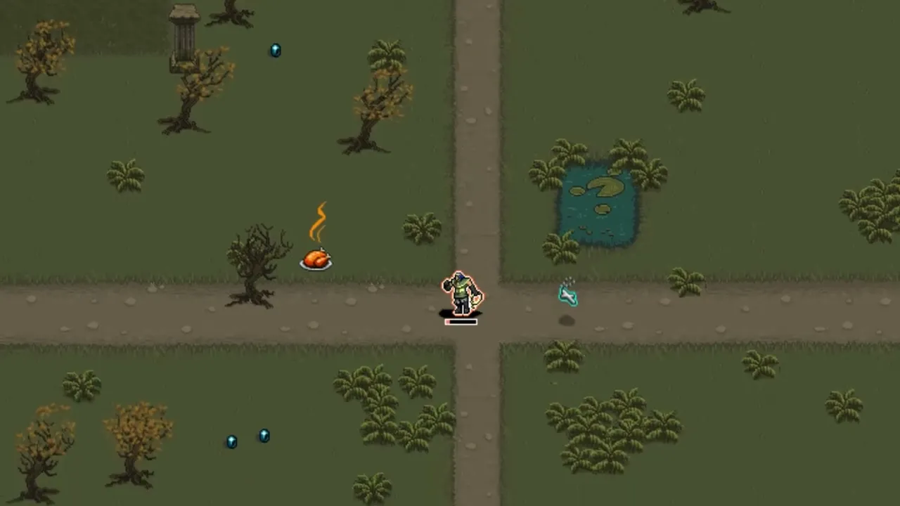
Readability was improved through careful consider and restraints of values, visual noise, size and relying more on shapes, symbols, and animation for visual communication.

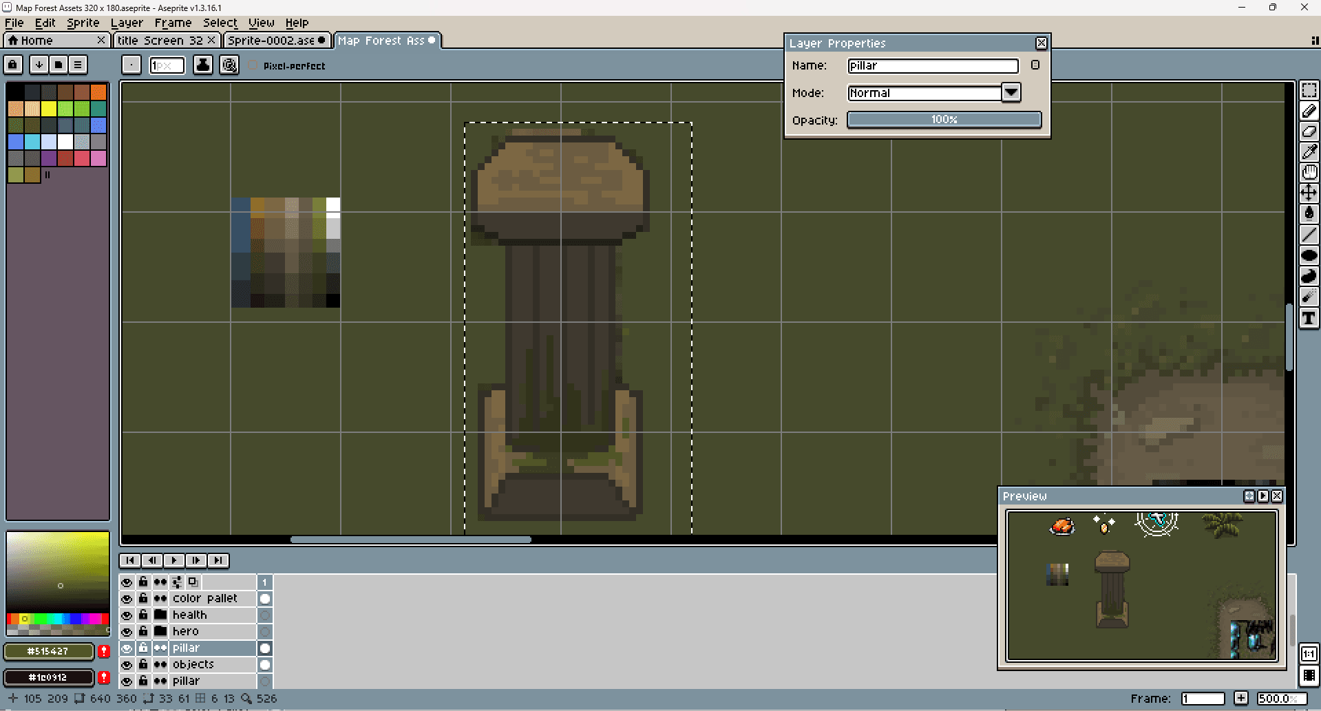
To determine good color values, I used a gray layer andr blending mode to quickly determine if foreground vs background had good clarity and contrast.

I intentionally limited the values of background, details like grass, to improve essential foreground items visibility. To improve player navigation and level design, I created more defined outlines of paths and water to be clearly indicate changes in the terrarian.

With the game assets grass, water, and road were made titleable to re-create the map.
Process


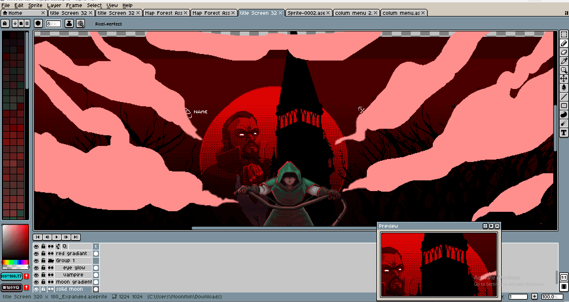
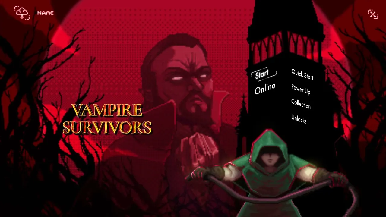
For the title screen, the aim was to create a more inviting splash screen that sets the tone of the narrative: a hero fighting against vampires through various environments. I simplified the subject matter to create a clear message while making more room for an expanding game menu for DLC and expansions.

The chosen sketch had a good balance, good contrast, followed the golden rectangle layout, and felt in the same spirit as the original. I replaced the visually loud blue and green buttons with a high contrasting black and white gothic UI for readability.

Graphics were crafted in Aesprite pixel software, exported as sprite sheets for Unity import. For the motion graphic, assets were imported into Adobe Photoshop for layout then exported to Adobe After Effects. 


For additional details and citations see Development Documentation PDF.

For the title screen, the aim was to create a more inviting splash screen that sets the tone of the narrative: a hero fighting against vampires through various environments. I simplified the subject matter to create a clear message while making more room for an expanding game menu for DLC and expansions.

The chosen sketch had a good balance, good contrast, followed the golden rectangle layout, and felt in the same spirit as the original. I replaced the visually loud blue and green buttons with a high contrasting black and white gothic UI for readability.

Graphics were crafted in Aesprite pixel software, exported as sprite sheets for Unity import. For the motion graphic, assets were imported into Adobe Photoshop for layout then exported to Adobe After Effects. 


For additional details and citations see Development Documentation PDF.

Results

The final resulting game assets are visually appealing, have greater readiblity, and more visually accessible to a

wider audience while respecting the retro brand of the game. Encouraging audiences once discouraged, to invest in the Studio's product.

Some of the phases had obstacles with hardware failure, learning curves, and scaling pixels. With flexibility to adapt and pivot dead lines were met while still providing quality product.


The final resulting game assets are visually appealing, have greater readiblity, and more visually accessible to a

wider audience while respecting the retro brand of the game. Encouraging audiences once discouraged, to invest in the Studio's product.

Some of the phases had obstacles with hardware failure, learning curves, and scaling pixels. With flexibility to adapt and pivot dead lines were met while still providing quality product.


© 2022–2025

© 2022–2025

© 2022–2025

All Rights Reserved

All Rights Reserved

All Rights Reserved

Create a free website with Framer, the website builder loved by startups, designers and agencies.